
The A to Z of UX - E is for Errors: 14 tips for how to handle the inevitable mistake
- UXcentric

- Sep 6, 2019
- 10 min read
Updated: Sep 3, 2025
Darren Wilson

Let’s be fair, people make mistakes all the time. It’s human!
The impact of the error is often dependent on the situation. Hitting the wrong character to misspell a word might be a minor irritation. Selecting the wrong button setting into motion a critical and irreversible action, can send you into meltdown!
We can also assume that if an error CAN be made, it WILL happen at some point. As such, unless it can be designed out, a plan is required for how to handle the user experience of the aforementioned error.
Errors can be categorised into many forms, but can be broadly put into two categories - slips and mistakes [1].
Slips are made when performing subconscious actions we are used to performing, such as pressing the wrong character on a keyboard or taking the wrong route. It often happens as we fail to apply the proper attention to the task, and are on ‘auto-pilot’.
Mistakes result from more conscious, deliberate actions. They occur in new situations, where incorrect decisions are made based on the information we have before us, which perhaps relates to our previous experience. For example, expecting a button to behave one way based on experience, yet it does something completely different.
It is widely accepted that the majority of people don’t read instructions when operating something for the first time. We figure things out as we go and prefer intuitive experiences that facilitate this.
As a result, we often make mistakes as we go. Providing supportive feedback, rather than criticism, can mitigate the onboarding of a new product.
The significance of the errors that we make can be used as a means to measure the usability of a given product or experience [2].
How many errors do users make?
How severe are these errors?
How easily can they recover from the errors?
We can measure and quantify error rates objectively, i.e. time or counters or subjectively via Likert Scales. We can also convert into value with respect to loss of productivity, i.e. time and resource [3].
As UX Designers, it’s our role to make experiences as compelling and usable as possible so that people can be efficient and effective. How to handle errors is a fundamental part of that success.
Here are some tips to design experiences, helping minimise pitfalls a user may encounter, and what to do when they do.
Prevention is better than cure
As designers, we should endeavour to eliminate as many potential errors as possible. We should fully understand the system design to see where they may transpire, and have them designed out wherever possible.
Where this is not possible, we can apply techniques to mitigate any risk of error.
1. Provide constraint
Constraining what the user can or cannot do in context will prevent them from trying to make an action that is not possible.
For example, if there is a limited set of correct responses, present these in a closed, bounded format, which will prevent an error from occurring, i.e. drop-down, radio button.
A good example of this is an address finder. Enter the postcode and then select the correct address from the drop-down provided.
Here is another example from a shoe size selector on the Schuh website. When clicking the drop-down for choosing a size, it removes the sizes that are now out of stock.
What I also like is that is goes a little further and informs which sizes are low in stock, therefore potentially preventing disappointment in future.
A nice boot too! ;)

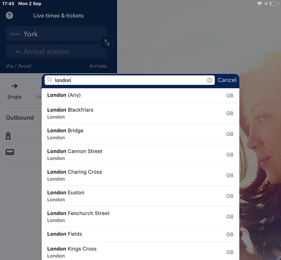
Trainline provides a contextual search to assist with finding the correct station you require. If there are multiple answers, and you’re not sure which is the correct one it helps you out.
For example, when heading to London, it could be that you have no idea which one is best. It provides and prioritises the selection of ‘Any’, saving time and prevents an error requiring corrective action later.
2. Display system status
One of Nielsen’s usability heuristics [4] is to provide visibility of system status. A useful way of providing this is via Rich Visual Modeless Feedback (RMVP) [5]. Rich, in terms of providing detailed feedback on what is happening, Modeless, for the user not being required to interact with the product to receive said feedback.
An example of this is during an install/update. On a mobile device, an app demonstrates at the point of access that activity is in progress, is unavailable and provides a cue when activity should be completed. That way, there is no error in requesting the app during this state.
On a Windows system, there is explicit information for the user not to turn off the device. It doesn’t say why, but I suspect all could go very wrong if you do!

Think about what information is critical for you and how it can be presented simplistically, requiring no interaction.
3. Build on familiarity
Using stereotypical UX components and iconography that users are familiar with increases the predictability of the correct functionality.
Using a familiar strategy doesn’t require using exactly the same implementation, but it should follow a strong metaphor that is easily understood. Otherwise, it may need explaining or annotating.
Amazon Music, Spotify and iTunes all use variants of the same shuffle icon, which fit in with their visual language. This ensures users can correctly identify the correct functionality.

4. Use affordances
Affordances are characteristics of an object that suggest how someone can interact with it. The concept was originally applied to physical objects - a door handle 'affording' the pulling action, while a door plate 'affords' pushing. The same theory also applies to digital.
In the early days, skeuomorphism was used to help users by making content appear more ‘real’. For example, digital buttons were designed to look like physical buttons that 'afford' pressing.
E-commerce sites also use the concept of a shopping basket/cart, which provides the affordance to go and pay for our purchases.

Today, we are more sophisticated in terms of what we know, but similar challenges apply with more complex interactions. Buttons are now more discernible to users, so the need for skeuomorphism is becoming redundant. We can now do this using shapes, contrast, colours and use of copy, for example.
However, other interactions, such as dragging content, may not be so obvious. Therefore, users need affordances to make them more apparent.
In this example from Google Maps, a simple line is used to draw the eye to a potential interaction point. It affords the action of pulling the tab up to reveal more content (but also acts as a button). This line changes shape to an arrow in context (to close the drawer).
In addition, shading and rounded corners are used above the map to create a shadow effect to demonstrate depth, giving the illusion of a floating tab that can be dragged away to reveal more of the map underneath, suggesting a drag interaction to reveal more content.
The shape of the drawer and the orientation of the line also communicated the direction of travel for the swipe action.
These techniques help make the discovery of the content more successful and reduce the possibility of an error.

5. Apply consistency
Applying a set of rules for designers to follow will promote consistency. It will save time and money and lay the foundations for a great user experience, keeping your customers happy.
It instils confidence and reassurance in the user. Having a consistent experience increases predictability, therefore reducing the need for learning and propensity for error.
For example, Material Design define what selection controls are and how they should be used in different contexts, etc. Once the user has learnt it in one place, they will quickly understand how to use it elsewhere, reducing the probability of error.

6. Use onboarding
Having downloaded a new app or opened a feature for the first time, the user is likely to be at their most open to being assisted. What is this app all about? What’s new? How do I interact with it? What new gestures are there? What can I do with it? What do these new terms mean?
Increasing discoverability is key to giving the user the knowledge and tools to complete tasks correctly and without error.
Providing a soft, high-level and contextual summary of what they have before them can facilitate learning significantly. Especially if there are hidden functions accessed via gestures or more complex interactions.
Some are simply instructional, and others get you to do the interaction itself to further enhance learning. For example, the Filmr app guides the user through a sequence of interactions to access the functionality correctly.

7. Provide guidance, before the error can be made
Modal dialogues, or prompts from the system requiring user interaction, are often overused or used incorrectly.
Providing guidance to avoid making the error in the first place is a more empathic strategy than beating people with error messages after the event.
As an example, when creating a new password, tell me what rules I need to follow, rather than correct me afterwards.

Another technique from Twitter is to highlight excessive content in a tweet. This is achieved by changing the background colour of the text over the threshold, and also by displaying the number of excess characters.
Again, there is a constraint as the action (reply/tweet) is disabled until remedial action is carried out. This prevents an error and the need for a subsequent message.

8. Remove ambiguity
The Trainline app is very slick at getting the user to specify exactly what they need. First of all, it gets the user to specify exactly when their travel requirements are, e.g locations and time.
It also allows the user to have the choice of stipulating whether the time is a leaving or arrival time, based on what they need. This gives the user control, removes ambiguity and reduces the risk of error.

9. Test, test, test
The best form of prevention, before your customer even sets eyes on what you’ve done, is to test.
Before investing in expensive development, test your idea. And test it again! Use goal-driven tasks to see if and where users struggle. And why.
Continually improve through rapid iteration and evaluate what actions you can take to mitigate any problems.
Cure, as and when required
In the event of an inevitable error happening, allow the user access to a solution that gets them out of their spot of bother.
10. Provide corrective action
Undo is SO underrated. It gets us out of so many problems where the end result isn’t quite what we wanted, expected or intended.
It provides users the ability to reverse their actions and return to a previous state, and/or allows them to see the consequences of their actions before committing to a decision.
This reassures the user. A comfort blanket that they can go back in time to somewhere safe, without every step being a potential pitfall.
There are several variations of undo style behaviour, which allow correction of mistakes. However, they share similar characteristics:
Undo the last single action (typically a mistake)
Undo a series of actions (allowing the user to experiment with an idea before deciding to commit to it)
Undo across save cycles
Ability to redo the undone action
Undo is normally executed via a dedicated button (typically having a reverse arrow icon), although there are stereotypical shortcuts (CTRL-Z).
Google presents an alternative undo solution following an action. This eliminates the need for pop-up style dialogue to mitigate potential mistakes and, as a result, is not as intrusive.

11. Eliminate unnecessary system errors
Systems are susceptible to error. And there needs to be routines to handle these. What is not acceptable, however, is to thrust them on the user. Software should be robust enough to handle all but extreme problems.
If it does not affect the user experience, then any problem should be hidden. I recently had Spotify informing me that there was no internet connection, despite music playing as normal.
I still had to close the error to get rid of it, despite it never being an issue, as the connection was restored. No idea why the error code was shown either. It didn’t give me anything useful. Argggghhh!

12. Design good error messages
Despite all the steps described above, there may still be a need to implement some error messages. This in itself could be the subject of another blog! But there are some high-level rules to follow [6].
Use constructive, supportive copy rather than critical.
Provide appropriate actions.
Don’t use error codes unless they are required to help diagnose the issue when relaying the issue.
Avoid use of BLOCK CAPITALS as it is aggressive and may further increase already high levels of anxiety and stress.
Messages should be precise and easily understood, no jargon!
Look at using humour to diffuse the situation, and further shift blame away from the user.

13. Confirm only once, if at all
While we don’t want to make errors, having to confirm every request can be an even bigger pain than making the error itself!
Confirmations are repeatedly shown for actions such as ‘Delete’. Yet if the user can recover from the action with a simple undo, or by opening the trash, is it necessary to show the confirmation in the first place?
If I delete a photo/file on iOS it’s moved to a temporary area. That’s cool. I get to ‘properly’ delete it later (or it automatically deletes after X time). Yet, I get a confirmation request on both occasions. Why?!
Give me a break and either:
Delete after the initial confirmation and don’t stash it.
OR stash it in the holding area until I have to delete it, or time elapses.

There are three simple rules to help minimise the number of confirmations you require:
Just do it! Don’t ask in the first place. So long as it isn’t a major issue, it shouldn’t be a problem.
Allow users to change their minds. Allowing the user to reverse an action reduces the criticality of an action and the need to check for confirmation.
Provide feedback. Guide users from making a mistake in the first place, particularly in instances where an undo action is not possible.
14. Be useful!
Is there anything worse than an error message telling you there is no error…?

And this. Really though…

Final thoughts
If errors can happen, they will.
Be prepared for them:
Recognise where and why errors may happen
Use preventative measures if the error cannot be eradicated
Where possible, erroneous actions should be reversible
Only highlight errors that have an impact on the user
Be supportive rather than critical, guiding the user along the correct path
References
[1] The Design of Everyday Things. Norman, D.A. (2002)
[3] Mobile Usability: How NOKIA changed the face of the mobile phone. Lindholm, C., Keinonen, T. and Kiljander. H. (2003)
[5] About Face: The Essentials of Interaction Design. Cooper, A., Reimann, R. Cronin. D & Noessel, C (2014)
[6] Interaction Design: Beyond human-computer interaction. Rogers, Y., Sharp. And Preece, J. (2012)
Get in touch with the author
Darren Wilson
Managing Director at UXcentric
07854 781 908


