
The A-Z of UX: N is for Navigation - Nine principles for helping people navigate digital products & interfaces with confidence
- UXcentric

- 1 day ago
- 16 min read
Darren Wilson

Navigation is not a menu problem
Most navigation problems are not menu problems. They are structural problems.
When people cannot find what they need, work out where they are, or move confidently through a product, the issue is rarely the menu itself. It is usually something deeper: unclear structure, weak prioritisation, vague labels, or routes that do not match how people actually approach the task.
That is why navigation matters so much. It is one of the clearest places where product decisions show up.
You can see what the team chose to prioritise, how clearly the product is organised, whether the structure makes sense from the user’s point of view, and how much interpretation people are being asked to do before they can act.
Good navigation gives people three things quickly:
A sense of what is available
A sense of where they are
A low-effort way to move forward
When those are missing, people rarely describe the problem as “poor information architecture” or “weak hierarchy”. They just say the product is hard to use.
Why navigation matters
When navigation works well, users barely notice it. They move with confidence, recover easily, and stay focused on what they came to do.
When it does not, everything slows down. People hesitate. They second-guess. They try to search because the menu is not helping. They take longer routes, miss things that matter, or give up entirely.
For product teams, that tends to show up as lower task completion, more support requests, slower onboarding, and unnecessary friction in conversion or service use.
Poor navigation also creates a hidden tax. Teams compensate with onboarding, training, tooltips, help content, and support processes when the real issue is that the product does not help people move through it clearly enough in the first place.
Why navigation problems are often symptoms, not causes
People tend not to describe navigation problems in structural terms, as they don’t think that way.
They do not say the information architecture is weak, the hierarchy is unclear, or the top-level choices are poorly prioritised.
Instead, they would likely say:
“I can’t find it.”
“I didn’t know that was there.”
“I don’t know where to go next.”
“I thought it would be under something else.”
That is what makes navigation so revealing. It is often the point where deeper product issues become visible.
When a product is hard to move through, the problem is rarely just the menu. It usually has an unclear structure, overlapping categories, weak labels, or routes that do not match how people actually approach the task.
That is why navigation should not be treated as interface polish. It should be treated as part of the product model itself.
“Anything your organization wants to share should be easy to find, navigate, and understand.”
Louis Rosenfeld, Peter Morville, and Jorge Arango
Principle 1: Get the structure right before you design the interface
If the structure is unclear, the interface will only disguise the problem for a while.
Navigation works best when it reflects a coherent information architecture: clear groupings, meaningful hierarchy, and boundaries that make sense from a user’s point of view.
If the structure is weak, teams end up trying to fix it with visual design, extra links, or increasingly clever labels. That rarely works for long.
Where products go wrong
Categories mirror internal teams or technical architecture
Similar content appears in multiple places
Navigation is added late to compensate for unresolved structure
Labels are expected to fix grouping problems, but they cannot actually solve them
What to look for
Can the structure be described clearly without showing the UI?
Do sections reflect user tasks rather than organisational ownership?
Would two new users be likely to organise the content in roughly the same way?
Real-world examples
Navigation only feels simple when the underlying structure makes sense to users.
✅ Good example – GOV.UK
GOV.UK works because the structure comes first. The navigation is not trying to disguise complexity with clever labels or decorative patterns. It is there to help users understand where they are in a service and what sits around them.
That sounds simple, but it only works because the underlying structure is clear enough that the navigation does not have to do extra work.

❌ Bad example – Duplicated destinations in complex products
This is what happens when structure starts to sprawl. Sections like “Reports,” “Analytics,” “Insights,” and “Dashboards” may all sound reasonable in isolation, but once the boundaries blur, the navigation stops helping people choose. The product asks users to work out its internal logic for themselves.
Principle 2: Prioritise the top-level choices that matter most
You can usually tell quite quickly whether a product has really prioritised its navigation. If the first layer feels noisy, everything after it gets harder.
Top-level navigation should help people get started, not force them to process every possible option before they can even begin. This is where many products show their hand.
What looks like a menu problem is often a prioritisation problem.
I often find that this is where teams try to resolve competing stakeholder demands at the interface rather than making clearer product decisions earlier.
Where products go wrong
Too many top-level items compete for equal attention
Rare tasks are given the same prominence as frequent ones
Business priorities crowd out user priorities
Navigation exposes inventory rather than intent
What to look for
Are the most important destinations visible immediately?
Are the options distinct enough to reduce ambiguity?
Could a first-time user make a likely first choice without reading everything?
Real-world examples
Top-level navigation should help users start quickly, not force them to process every possible option.
✅ Good example – Apple’s top-level navigation
Apple’s top navigation works because it does one job well: it helps users choose a product family without forcing lower-level decisions too early. The restraint is the point.
You are not being asked to think about storage, trade-in, support, or buying options straight away. You are simply choosing the part of the range you want to explore. That keeps the first decision light and makes the rest of the journey easier.

❌ Bad example – Overloaded mega menus
Mega menus can look comprehensive from the team’s perspective, but that completeness can come at a cost.
When the first layer tries to surface everything at once, users are forced to sort, scan, and compare before they have even started. The structure may be thorough, but the navigation is doing too much too early.
Grouping can help, but only if it reduces choice rather than repackages overload.
Principle 3: Use clear, familiar, predictable labels & controls
Labels are promises. They shape expectation before action.
“Users spend most of their time on other sites. This means that users prefer your site to work the same way as all the other sites they already know.”
Jakob Nielsen
That applies to language as much as layout. When labels are clear and familiar, users move with confidence. When they are vague, brand-led, or internally defined, people must interpret them before acting.
Where products go wrong
Generic labels such as “Solutions,” “Explore,” or “Resources”
Internal terminology leaks into the UI
Similar actions are named differently in different places
Familiar-looking controls behave in unfamiliar ways
What to look for
Would a first-time user understand the label without extra context?
Does the wording match user intent?
Does the control behave the way its appearance suggests it should
Real-world examples
Labels shape expectations before users act, so clarity here has an outsized impact on confidence.
✅ Good example – task-led labels in ecommerce and account areas
Labels such as “Orders,” “Returns,” “Billing,” or “Search” reduce ambiguity because they map directly to intent.

❌ Bad example – Vague umbrella labels
When users have to decode whether “Capabilities,” “Tools,” or “Discover” contains what they need, the product is spending their attention too early.
Principle 4: Design for scanning, recognition & low-effort choice
People do not read navigation like a document. They scan it.
They are not trying to admire the structure. They are trying to keep moving.
Good navigation helps them do that by making likely routes easy to recognise. Strong grouping, clear hierarchy, predictable placement, and restrained choice sets all reduce the amount of interpretation users have to do.
If people have to stop and think too hard at the point of choice, the navigation is already asking too much of them.
This is where tidy-looking menus can still fail. On paper, everything may be organised. In practice, the user is left scanning the same set of options repeatedly because nothing stands out clearly enough to help them make a choice.
Where products go wrong
Too many options carry equal visual weight
Navigation has to be read line by line
Grouping is weak or inconsistent
Novelty is prioritised over recognition
What to look for
Can users scan the options in seconds?
Do grouping, spacing, and hierarchy do most of the work?
Are the likely routes visible without shouting?
Real-world examples
Good navigation reduces effort by helping users recognise likely routes quickly rather than decode them.
✅ Good example – Google search results
Google’s results page is useful here because it is built for scanning, not admiration. It assumes users are trying to spot the most promising route quickly, not read every line in order.
The hierarchy is clear, the spacing is predictable, and the result format is familiar enough that people can move fast without feeling rushed. The page is doing exactly what good navigation should: making the next choice easier.

❌ Bad example – Dense dashboards and utility-heavy sidebars
This is where tidy-looking interfaces often break down. Everything may be technically visible, but the user is left to do too much interpreting because the layout gives too many elements equal weight.
Nothing stands out clearly enough to guide the next step, so people slow down, repeatedly scan the same area, or fall back on search because the navigation has stopped helping.
“When deciding which links to click on the web, users choose those with the highest information scent..”
Nielsen Norman Group - Raluca Budiu
Principle 5: Support navigation at more than one level
People need more than one layer of orientation.
Top-level navigation tells them what broad areas exist. Secondary navigation, local navigation, and breadcrumbs help them understand where they are within the structure and move between levels without losing their bearings.
This is where products often reveal whether they truly support orientation or simply expose options. Users do not just need to know what is available. They need to understand how things relate to one another.
When that relationship is missing, the product can still look tidy while feeling strangely flat. Everything is there, but the user has to work too hard to understand how the pieces fit together.
Where products go wrong
Everything is flattened into one level
Secondary navigation is missing or inconsistent
Hierarchy exists, but is not made visible
Breadcrumbs are used as decoration rather than orientation
What to look for
Can users move easily between the overview and the detail?
Is hierarchy visible when it matters?
Are local navigation patterns consistent within sections?
Real-world examples
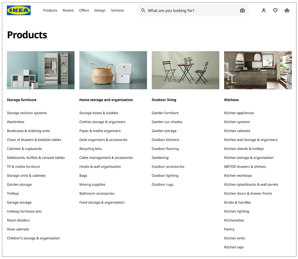
Users rely on hierarchy to understand where they are, what sits around them, and how to move between levels.
✅ Good example – Hierarchical services and content-rich sites
A good hierarchy does more than expose links. It reassures. A breadcrumb trail, local navigation, or clearly structured section tells the user not just where they can go, but where they are in relation to everything else.
That matters because confidence often comes from understanding how the whole thing hangs together, not just the page you're on.
IKEA is a better fit here because the hierarchy is doing visible work. Users are not just shown a set of links. They are shown how broad areas, narrower categories, and related routes fit together.
That makes it easier to understand where they are, what sits nearby, and how to move between levels without losing the bigger picture.
❌ Bad example – Flat navigation in large products
If the product has real depth but the navigation pretends it does not, users lose both location and relationship.
Principle 6: Make context, status & available actions obvious
Navigation is not only about the destination. It is also about orientation.
Users need to know where they are, what state they are in, and what they can do next.
A useful usability principle here is visibility of system status:
“Designs should keep users informed about what is going on, through appropriate, timely feedback.”
Nielsen Norman Group - Aurora Harley
That applies to navigation as much as it does to feedback. When context and status are unclear, even technically successful journeys can feel fragile or confusing.
Where products go wrong
Current location is unclear
Progress disappears inside flows
Pages expose content, but not likely next actions
State changes happen without visible confirmation
What to look for
Can users tell where they are at a glance?
Is progress visible in multi-step tasks?
Are next actions obvious in context?
Real-world examples
Clear context and visible status help users stay oriented and reduce the uncertainty that causes hesitation.
✅ Good example – Structured service flows and clear checkouts
Booking.com’s flow is a good example here because it keeps the user oriented throughout the journey. The current step is visible, the wider booking flow is still in view, and the next action is clear.
That matters because users need to complete the task. They need to feel confident that they are in the right place and making progress.

❌ Bad example – Modal-heavy and layered interfaces
Layered interfaces often fail not because the actions are impossible, but because they keep pulling context away.
The user can still complete the task, but they are forced to keep reorienting themselves as the product shifts among panels, overlays, and partial states. That makes the experience feel more fragile than it needs to.
Principle 7: Give people more than one way to reach key destinations
People do not all navigate in the same way.
Some browse. Some search. Some use shortcuts. Some return through a recently viewed list or a history page.
In practice, this is where teams often mistake “search will handle it” for a real navigation strategy.
Search is useful. Shortcuts are useful. A recent list is useful. But none of them removes the need for a product to give people more than one sensible way of getting somewhere important
That matters because users are not all in the same mode. Sometimes they are exploring. Sometimes they already know what they want. Sometimes they are returning to something half-finished.
Good navigation supports that variation rather than forcing everyone down a single rigid path.
Where products go wrong
One rigid route is treated as sufficient
Search is expected to rescue the weak structure
Experienced users are forced through novice flows
Navigation ignores interruption and returns
What to look for
Can users browse, search, and shortcut where it makes sense?
Are important destinations reachable in more than one way?
Does the product support both exploration and finding something specific?
Real-world examples
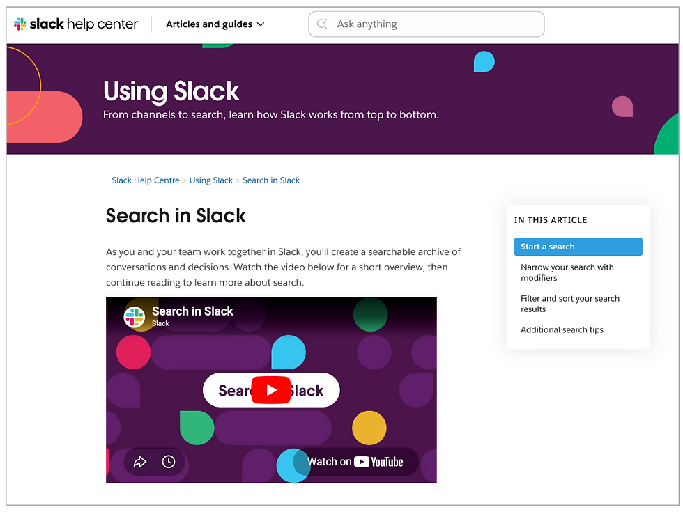
Different users reach the same destination in different ways, so good navigation supports multiple routes.
✅ Good – Slack, Notion, and Linear
What these products get right is that search is not being asked to rescue weak structure. It sits alongside it. Users can browse, search, use shortcuts, or jump back through recent work depending on what they are trying to do.
That matters because people are not always in the same mode. Sometimes they are exploring. Sometimes they know exactly what they want. Sometimes they are just trying to get back to something they touched five minutes ago.
These products support that variation rather than pretending one route is enough.
❌ Bad – Single-path task flows
Single-path navigation usually reveals itself when the product assumes everyone will approach the task in the same way, in the same order, every time.
That might feel neat from a process perspective, but it leaves users with no flexibility when they want to search, use shortcuts, return, or recover. The structure may be there, but the routes through it are too narrow.
Principle 8: Match the navigation pattern to the task, device & context of use
There is no universally correct navigation pattern.
The right pattern depends on whether users are browsing or completing a task, whether they are on desktop or mobile, whether they are novice or experienced, and whether they are exploring or trying to get back to something quickly.
Just because a pattern is consistent across devices does not mean it is right for all of them. A pattern can be familiar and still be the wrong fit for the task or context. This is where teams often confuse design consistency with interaction consistency.
You can see this in products that proudly “keep everything the same everywhere”, even when the device, context, and user behaviour have changed.
Where products go wrong
Desktop navigation is forced onto mobile unchanged
Patterns are chosen for consistency rather than suitability
Task flows are treated like browse flows
Contextual needs are ignored in favour of one standard pattern
What to look for
Does the pattern fit the task?
Does it fit the device?
Does it support the context of use without adding unnecessary complexity?
Real-world examples
The best navigation patterns feel natural because they suit the task, device, and context, rather than forcing a single model across all contexts.
✅ Good – Bottom navigation in mobile apps with a small number of core destinations
This works because the pattern matches the context. On mobile, users often need quick access to a small number of primary areas and fast switching between them. A bottom navigation bar supports that well by keeping the main routes readily accessible.
In tools like Linear Mobile, the stronger point is not just that bottom navigation exists, but that it can be customised to fit the user’s workflow rather than stay rigid for the sake of consistency.

❌ Bad – Desktop navigation forced onto mobile
This is a common case of mistaking consistency for usability. A menu system that works well on a desktop can become clumsy very quickly when it is compressed onto a small screen without rethinking the interaction model.
The structure may still be there, but the effort required to move through it has increased, which usually means the pattern no longer fits the context.
Principle 9: Test whether people can find, understand & recover
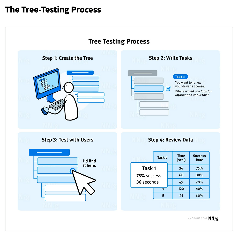
Navigation should be tested, not assumed.
A useful rule here is simple: If you’re not checking, you’re guessing.
Tree testing is especially useful because it isolates hierarchy and labels before interface polish muddies the signal.
It helps teams validate whether users can actually find key resources in a proposed or existing hierarchy, and whether the first route they choose is likely to get them there.
Where products go wrong
Navigation decisions are signed off through internal review only
Labels are debated rather than tested
Aesthetic approval stands in for findability evidence
Recovery from wrong turns is ignored
What to look for
Can users find key tasks without coaching?
Do they choose the intended path first?
Can they recover quickly when they choose the wrong route?
Real-world examples
Navigation should be tested in practice, not assumed in theory.
✅ Good – Tree testing and iterative information architecture validation
Tree testing is useful because it strips the problem back to what matters: can people actually find what they need in the structure you have created?
It is a good reminder that navigation should not be judged by how tidy it looks, but by whether people can use it confidently without being nudged in the right direction.
❌ Bad – “It looks obvious to us”
This is how navigation debt survives. The team understands the structure because they built it, so it feels self-evident. Users do not have that advantage. If findability has not been tested, confidence in navigation is usually based on internal familiarity rather than evidence.
How navigation is evolving, and how well products are keeping up
Navigation is changing, but not because menus are disappearing.
What is really happening is that products are layering new routes on top of older ones: menus, search, shortcuts, command interfaces, and now increasingly AI.
The strongest products are not replacing navigation with something newer. They are giving users more ways to move through a system without losing the clarity underneath.
That distinction matters because the newer patterns are useful only when they still respect the basics: structure, labels, context, and findability.
Search-first and command-based navigation
Products like Slack, Notion, and Linear increasingly treat search, quick find, and command interfaces as core navigation mechanisms. That is a real shift. But it does not make the structure irrelevant.
Search and command interfaces work best when users know roughly what they are looking for or can name it.
They are weaker when people are exploring, learning, or trying to understand what is available. In other words, they are excellent additional routes, but poor substitutes for weak structure.
AI is adding a route - not replacing navigation
The strongest current AI trend is not “AI replaces navigation.” It is “AI adds a new route through the system.”
That can be useful. It can reduce context switching, help users retrieve known items across fragmented systems, and support quicker synthesis when the right answer is spread across multiple places.
But it also introduces risk.
Recent NN/g research suggests that users turn to generative AI to explore and synthesise information, but still rely on traditional search when accuracy and trust are critical.
Separate NN/g research on AI chatbots built into websites also shows that users want quick, direct answers rather than vague conversation.
If anything, AI makes clear structure more important. The less predictable the system becomes, the more users need strong cues about where they are, what is happening, and how to recover when something goes wrong.
The principle test
These newer patterns work when they still respect the fundamentals:
Clear structure underneath
Predictable labels
Multiple routes
Visible context
Pattern-task fit
Real findability testing
They fail when teams assume AI, search, or personalisation can compensate for weak navigation design.
Final Thoughts
Navigation is not a layer you add at the end. It is the visible result of decisions about structure, priorities, labels, context, and movement.
When those decisions are coherent, navigation feels almost invisible. People know where they are, what they can do, and how to move forward.
When those decisions are weak, navigation becomes the place where users feel the product’s internal confusion.
That is why navigation matters so much. It is not just how people move through an interface. It is how clearly the product expresses itself.
And when users keep getting lost, the answer might not be a menu tweak. Before resorting to that, consider a better structure, clearer priorities, and stronger evidence to support it.
Further reading
Alan Cooper | About Face: The Essentials of Interaction Design
Steve Krug | Don’t Make Me Think
Jakob Nielsen | Jakob’s Law of Internet User Experience
Nielsen Norman Group | Visibility of System Status
Nielsen Norman Group | Tree Testing: A Simple Technique for Evaluating Information Architecture
Nielsen Norman Group | Breadcrumb Navigation Increasingly Useful
GOV.UK Design System | Breadcrumbs
GOV.UK Design System | Service navigation
Information Architecture Institute | What is Information Architecture?
Rosenfeld, Morville & Arango | Information Architecture for the Web and Beyond
Nielsen Norman Group | GenAI for Complex Questions, Search for Critical Facts
Nielsen Norman Group | Less Chat, More Answer: Site AI Chatbots Need to Get to the Point
Get in touch with the author
Darren Wilson
Managing Director at UXcentric
07854 781 908


